Growth Advocate® Brand Studio
-A Pasley Commercial Interiors Company
Branding Project
How Growth Advocate® Brand Studio provided value:
Pasley Commercial Interiors developed a complete brand identity for Trust Engineering, a structural and civil engineering firm entering the competitive Colorado Springs commercial market. The engagement included brand strategy, competitive positioning, visual identity development, voice guidelines, and foundational messaging, creating a market-ready brand from the ground up. The result was a clear and differentiated brand that communicates expertise, builds trust, and helps the firm connect with the right clients from the very first conversation.
.png)
Trust Engineering runs on a single conviction: that a solution always exists. The principals are driven by the joy of winning for clients, by faith, family, and the satisfaction of celebrating every project milestone together.
.png)
They build dependable systems, pace every engagement around genuine problem-solving time, and stay fully engaged from design through construction. Brian and Mary Huston hold Professional Engineer licensure across Colorado, Wyoming, and Florida — a credential earned, not claimed.
.png)
Clear solutions for complex engineering problems. Not just stamped drawings — an experience that leaves every client feeling more capable and confident than when they arrived.
.png)
The bullseye client is a commercial developer or contractor in the Colorado Springs metro area, aged 35–55, managing projects between $2M and $50M. They work alongside architects, contractors, and government project managers on sophisticated projects where getting the engineering wrong is not an option. They've been burned by delays and cost overruns before. What they want is an engineer they can call directly, trust completely, and rely on to make them look smarter in front of their own clients. They value relationship and clear communication alongside technical excellence — and they're willing to pace a project properly to get the best outcome.
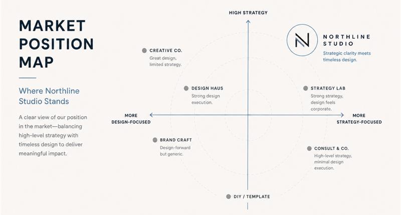
Two archetypes were selected to define how this brand speaks. The Sage — as the primary voice — positions Trust Engineering as the firm that educates, clarifies, and eliminates uncertainty. Its audience responds to expertise and intelligence that is articulated without condescension and always grounded in fact. The Caregiver adds warmth and a genuine partnership dimension: the sense that this team is invested in your success, not just your invoice. If this brand were a person, it would be Bjarke Ingels — technically brilliant, visually communicative, and disarmingly collaborative.
"Let's identify the structural solution that best serves your timeline, budget, and long-term project goals."
"This meets code and industry standards."
"We'll walk you through our approach so thoroughly that you can confidently explain it to your own clients and stakeholders." We don't say: "We've completed the structural calculations and specifications."
"We've completed the structural calculations and specifications."
"Permitting and approvals can derail projects — we'll navigate those proactively so you stay on schedule." We don't say: "We'll submit the plans for approval and respond to RFI questions."
"We'll submit the plans and respond to RFI questions."


The visual language was built to signal premium, modern professionalism in a market where competitors rely on tired industry conventions. Slate Navy anchors authority while Antique Red delivers confidence without aggression, and cool neutral backgrounds give the system room to breathe across digital and print contexts. Roboto Light handles body text — authoritative, modern, and legible at any scale. The brandmark system includes a full logo lockup with tagline, a compact mark for smaller applications, and an icon-only stamp for the browser favicon and small-format uses.
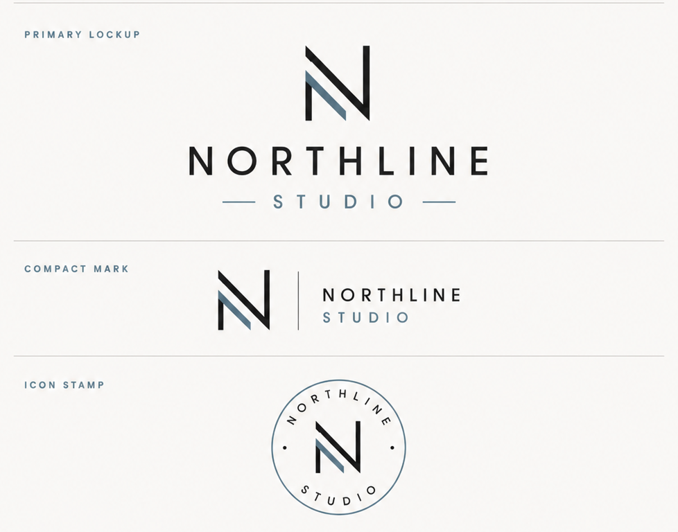
This is a description of what we developed for this image block. This is a description of what we developed for this image block. This is a description of what
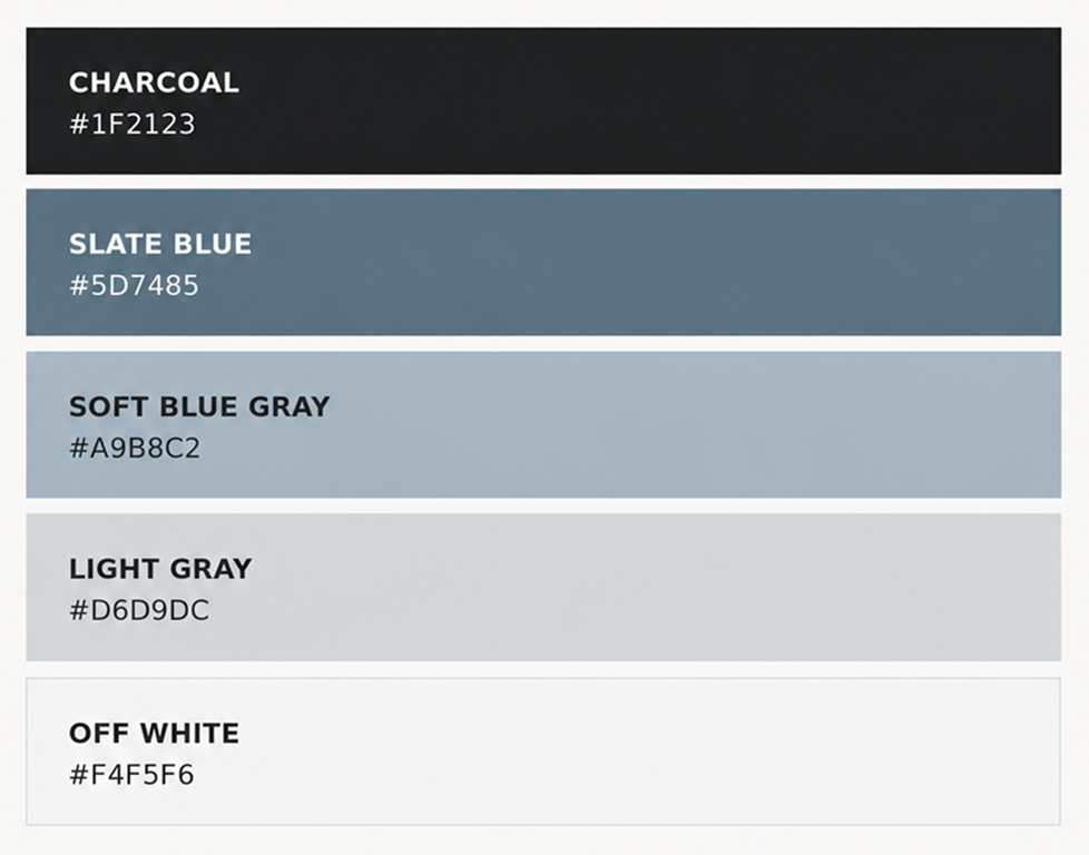
This is a description of what we developed for this image block. This is a description of what we developed for this image block. This is a description of what
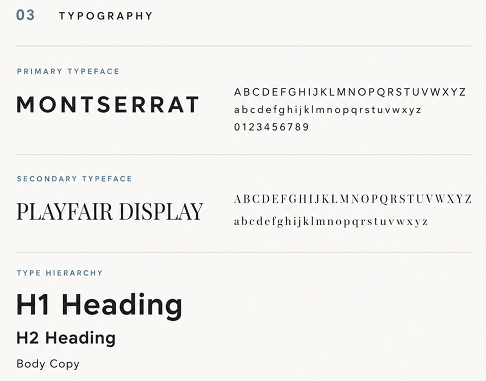
This is a description of what we developed for this image block. This is a description of what we developed for this image block. This is a description of what
This is a description of what we developed for this image block. This is a description of what we developed for this image block. This is a description of what
The brand launched with language built to win the right clients from the first conversation. The tagline — Confident Solutions. Dependable Partners. — balances the Sage's authority with the Caregiver's warmth in five words. The primary value proposition opens with: "We translate architectural ambition and project constraints into buildable engineering solutions. Your vision stays intact; the uncertainty disappears." Every client-facing message was written to make the ideal client feel capable, seen, and ready to say yes.
"Before this process, I could describe what I did technically — but I couldn't explain why anyone should choose us over the competition. Now I have the words, the look, and the logic to walk into any room and win the right client."— Brian Huston, Principal, Trust Engineering

Visit Trust Engineering ->


All demonstrations of the brand language, visual assets, logos, brandmarks, color systems, typographic choices, and strategic frameworks shown in this case study were developed and are owned by Pasley Commercial Interiors. Reproduction or use without written permission is prohibited.
Graphic Designer:

.avif)
